A cold AI built a settings screen and exposed two rough edges
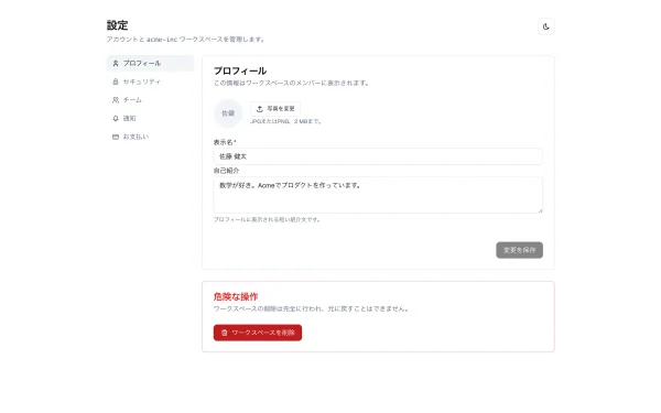
/settingsCaptured at a 375px viewport. Long pages scroll inside the frame.
The screenshots stay in Japanese. Every round is a real screen for a real Japanese industry, so an English re-render would no longer be the screen the agent actually produced.
Write-up
A cold AI built a settings screen and exposed two rough edges
Build log series: I hand a real screen to an AI that has never seen Gunjo (
@gunjo/ui) and let it build. Each round also works as a practical guide to building the same screen with Gunjo. Round one: a settings screen.
When I built @gunjo/ui, I wrote that it was designed for AI to use. Everything imports from one typed entry point, component specifications are machine-readable, and the documentation can be handed directly to an agent. The idea was to give AI something it can read and use, not just inspect.
That was still only a claim. Anyone can write one, so I put it to the test.
The setup: as little prior knowledge as any new user
I gave a cold agent (one that has never seen the library) only these conditions:
- The public npm package
@gunjo/ui and the gunjo.jp docs - No source code, which put it in the same position as anyone adopting the package
- A blank Next.js app (React 19 and Tailwind v4)
- A working result that it had to take through
npm run buildon its own
The assignment was a settings screen: tabs for Profile and Notifications, a profile form (name, email, and avatar), a Select for roles, and a Switch for notifications. It is the kind of screen almost every real app needs eventually.
What happened
The agent read the docs first and found the three-line setup.
/* app/globals.css (Tailwind v4) */
@import "tailwindcss";
@config "../node_modules/@gunjo/ui/tailwind-preset.js";
@source "../node_modules/@gunjo/ui/src/**/*.{ts,tsx}";
@import "@gunjo/ui/styles";
Then came the part the design was meant to support: it imported every component it needed from one place, @gunjo/ui.
import {
  Avatar, AvatarFallback, AvatarImage,
  Button, Card, CardContent, CardHeader, CardTitle,
  Container, FormField, FormLabel,
  Input, Select, Separator, Switch,
  Tabs, TabsContent, TabsList, TabsTrigger,
} from "@gunjo/ui";
It never got lost. One look at the @gunjo/ui entry point showed what was available and what could be composed. The implementation followed the docs too.
<Tabs defaultValue="profile">
  <TabsList className="w-full">
    <TabsTrigger value="profile" className="flex-1">Profile</TabsTrigger>
    <TabsTrigger value="notifications" className="flex-1">Notifications</TabsTrigger>
  </TabsList>
  <TabsContent value="profile">
    <Card>{/* Profile form */}</Card>
  </TabsContent>
</Tabs>
Result: 4/5. It worked
npm run build passed. The tabs, form, and toggles worked on a real device, with no console errors. The agent had completed a working settings screen.
The agent gave the library 4/5. Its strongest point was exactly what I had designed for: all components are available, with types, from one place. In the agent's words, it could "see what components exist in one file," already organized into input, display, and navigation groups. The intent reached a user with no prior context.
It also found real rough edges
The score was 4/5, not perfect. The missing point came from rough edges the agent reported plainly.
- Several form components had fixed widths baked in, so filling the card required a
classNameoverride - The package linked to docs that were not included, producing a 404 for users
I could have stopped at "an AI used it" and called the test a success. The missing point was more useful. The agent tripped over the same small obstacles a new adopter would hit first.
What I fixed: feeding the report back into the system
I fixed the findings in issue #47.
-
Input,Select,Tabs, andSeparatornow fill the available width by default. A narrower width becomes an explicit choice. - This is where the single source of truth (SSOT) matters. The fixed-width values came from the design source (
.pen), so I had to align the design source, implementation, showcase, and thumbnails beforenpm run design:verifywould pass. The verification path makes omissions difficult. - I also restored the missing docs and repaired the broken links.
The rough edges did not lead to a one-off patch. They came back as one consistent correction across design, implementation, and documentation. That is the backbone of Gunjo.
What I took away: use it, find the friction, fix it
Have the AI use it | Find the rough edges | Fix every source consistently (SSOT) | Run it again
"AI can use it" is not something I can prove by declaring it. The only proof is to hand it to an agent with no prior knowledge and keep removing every obstacle it finds. No embellishment and no hiding the misses. Gunjo was still in early alpha at the time, and I wanted to show the whole process.
Next up: build log #2 and beyond
The settings screen was only the entry point. I will keep the same no-prior-knowledge setup and move through patterns that appear constantly in real apps.
- A modal announcement banner, testing when to use
DialogorToast - A carousel, for media lists and the main content block on a landing page
Each round will remain a practical guide to building the same thing with Gunjo.
The run
- gunjo.jp: docs, showcase, and patterns
- npm:
@gunjo/ui / GitHub - Overview: Gunjo (
@gunjo/ui): a design system that keeps design, code, and docs aligned - GunjoUI by UIXHERO
Gunjo was still in early alpha at the time; issues are welcome.
This series is co-created with AI (Claude and Codex). A human designs the experiments, makes the calls, and fact-checks before publishing; the AI does the hands-on work and drafting.
Components from @gunjo/ui
The components this screen's source imports directly.
The code the agent actually wrote
Click a file to expand its source.